

Theming
Adjust brand color, radius and dark mode of the chat components by overriding CSS variables.
Theming
The chat has no theme prop. Its colors come from CSS variables in the SDK's stylesheet (@openmaxai/chat-sdk/styles.css), so you change them in your own CSS: set the theme input variables (--omx-*) for the common cases, and override the internal variables on .omx-chat only for what those do not cover.
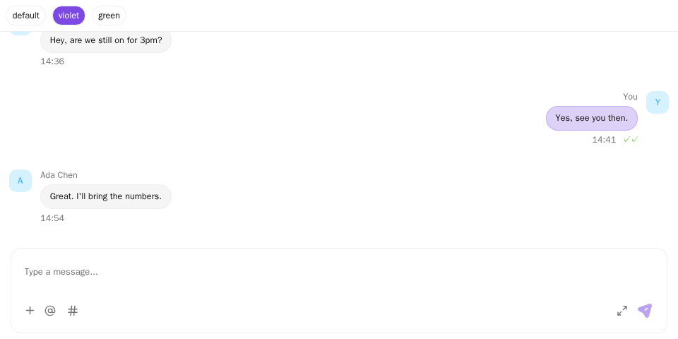
Screenshot of this demo. It runs on an in-memory sample host (useDemoHost from the demo kit, which is not part of the packages); in your app, pass the host from createChatHost() instead.
Demo source (uses the docs demo kit and Tailwind CSS classes, so it cannot be copied as is): theming-custom-colors.tsx
"use client";

import { ChatHostProvider } from "@openmaxai/chat/host";
import { MessageThread } from "@openmaxai/chat/message-thread";
import { type CSSProperties, useState } from "react";
// Docs helpers: useDemoHost() is an in-memory host with sample data (no backend).
// In your app, pass the host from createChatHost() or your own ChatHost instead.
import { useDemoData, useDemoHost } from "./kit";

// The chat reads the CSS variables of @openmaxai/chat-sdk/styles.css. Override them on any wrapper element.
const THEMES = {
	default: {},
	violet: {
		"--primary": "oklch(0.55 0.22 293)",
		"--primary-foreground": "oklch(0.98 0 0)",
		"--ring": "oklch(0.55 0.22 293)",
		"--radius": "1rem",
	},
	green: {
		"--primary": "oklch(0.55 0.15 155)",
		"--primary-foreground": "oklch(0.98 0 0)",
		"--ring": "oklch(0.55 0.15 155)",
		"--radius": "0.25rem",
	},
} as const;

type ThemeName = keyof typeof THEMES;

export default function ThemingDemo() {
	const host = useDemoHost();
	const { conversations } = useDemoData();
	const [theme, setTheme] = useState<ThemeName>("violet");

	return (
		<ChatHostProvider host={host}>
			<div
				className="flex h-full flex-col bg-background text-foreground"
				style={THEMES[theme] as CSSProperties}
			>
				<div className="flex gap-2 border-b p-2 text-xs">
					{(Object.keys(THEMES) as ThemeName[]).map((name) => (
						<button
							key={name}
							type="button"
							onClick={() => setTheme(name)}
							className={`rounded-md border px-2 py-1 ${
								theme === name ? "bg-primary text-primary-foreground" : ""
							}`}
						>
							{name}
						</button>
					))}
				</div>
				<MessageThread conversation={conversations[1]} />
			</div>
		</ChatHostProvider>
	);
}
For the stylesheet import and ChatRoot, see Installation. The stylesheet declares the variables on every .omx-chat node: the component root each SDK component brings along inside ChatRoot, the ChatRoot overlay landing node and the node the floating surfaces render into.
Theme input variables
Experimental. The stylesheet reads a small set of public variables and never declares them itself. Set them on a common ancestor of the chat and of everything rendered outside it (the overlayContainer node, the floating surfaces' container), usually :root. Custom properties inherit, so the value reaches every part of the chat with ChatRoot and with ChatShadowRoot alike, Shadow DOM included; no .omx-chat selector and no load order is involved:
src/globals.css
:root {
  --omx-primary: #7c3aed;
  --omx-radius: 8px;
  --omx-font-sans: "Inter", system-ui, sans-serif;
}
The list is also exported as CHAT_THEME_VARIABLES from @openmaxai/chat-sdk. Unset, each variable falls back to the default below, so the chat looks exactly as before.
| Variable | Light default | Dark default | What it changes |
|---|---|---|---|
--omx-primary |
#21b1ff |
#21b1ff |
Brand color: own bubbles, buttons, selection. Focus rings follow it |
--omx-primary-foreground |
oklch(0.985 0 0) |
oklch(0.985 0 0) |
Text on the brand color |
--omx-background |
oklch(1 0 0) |
oklch(0.145 0 0) |
Background. Card surfaces (panels, bubbles) and popovers (menus) follow it |
--omx-foreground |
oklch(0.145 0 0) |
oklch(0.985 0 0) |
Body text, and text on cards and popovers |
--omx-secondary |
oklch(0.97 0 0) |
oklch(0.269 0 0) |
Secondary buttons. Hovered menu items follow it |
--omx-secondary-foreground |
oklch(0.205 0 0) |
oklch(0.985 0 0) |
Text on secondary buttons and hovered menu items |
--omx-muted |
oklch(0.97 0 0) |
oklch(0.269 0 0) |
Subdued surfaces |
--omx-muted-foreground |
oklch(0.556 0 0) |
oklch(0.708 0 0) |
Subdued text (timestamps, hints) |
--omx-border |
#eceef2 |
oklch(1 0 0 / 10%) |
Borders. Input borders follow it |
--omx-radius |
calc(0.625 * var(--omx-rem, 16.8px)) |
same | Base radius; rounded-sm … rounded-4xl scale from it |
--omx-font-sans |
the system sans-serif stack | same | Body font |
--omx-rem, the size base described in Size, works the same way and is not in the list.
What "follows" means: those surfaces have no variable of their own, they take the value you set. By default some of them differ a little (cards and popovers are a shade lighter than the background in dark mode, input borders and focus rings are their own grays); once you set the variable they all use your value.
Light and dark. A variable you set applies in both color schemes. To use a different value in dark mode, set it in your own light and dark scopes and keep them in step with the colorScheme you pass to the chat:
:root {
  --omx-background: #fafafa;
}

:root[data-theme="dark"] {
  --omx-background: #18181b;
}
If you set a variable only in your light scope, the chat uses the SDK's dark default for it in dark mode.
Write lengths for --omx-radius in px or as calc(N * var(--omx-rem, 16.8px)): a rem you set here follows your root font size, not the chat's --omx-rem. --omx-primary does not recolor every brand-blue detail; the ones listed under Change the brand color have no input variable yet.
The unprefixed variables the stylesheet declares (--primary, --card and the rest of the reference) are internal: their names, values and which of them read an input variable may change in any release.
Change the brand color
For the brand color itself, --omx-primary above is enough. Some details carry the brand color in variables of their own that no input variable reaches; to change those, override the internal variables on .omx-chat, after the import (these names are not guaranteed, see above; with ChatShadowRoot your page CSS cannot reach .omx-chat):
src/globals.css
@import "@openmaxai/chat-sdk/styles.css";

.omx-chat,
.omx-chat.omx-dark {
  --primary: #7c3aed;
  --primary-ink: #6d28d9;                /* small brand-colored text: keep 4.5:1 contrast */
  --coco-cyan-10: rgb(124 58 237 / 0.1); /* background of the "Agent" tag */
  --radius: calc(0.75 * var(--omx-rem, 16.8px));
}

.omx-chat.omx-dark {
  --primary-ink: #a78bfa;
}
--primary-hover, --badge-channel-fg and --badge-agent-fg derive from --primary.
These variables also default to brand colors, but they are separate values that do not follow --primary, so change them too:
--primary-ink,--coco-cyan-10: changed in the example above. If you leave them, the Agent tag next to a name and the active header button stay blue.--badge-channel-bg,--badge-agent-bg: backgrounds of the "Channel" badge and the Agent badge, light brand blue and light cyan by default. If you only change--primary, the badge text changes color but the background does not.--panel-gradient,--panel-bar-bg: the gradient at the top of the conversation list panel and the header background, light brand blue by default.--coco-blue-l1-30: the background of the conversation list search box, light brand blue by default.
Set these internal variables on .omx-chat, not on :root or a wrapper of your own (unlike the input variables above): the stylesheet declares them on each .omx-chat node, so values from an ancestor are replaced there. A rule on .omx-chat reaches the components, menus, dialogs and floating windows alike. List .omx-chat.omx-dark as well, or the dark values (declared under that selector) win in dark mode.
This is for ChatRoot. Inside ChatShadowRoot, rules from your page do not reach .omx-chat; see The host element in Shadow DOM.
Dark mode
Pass colorScheme to ChatRoot:
<ChatRoot colorScheme={prefersDark ? "dark" : "light"}>{/* … */}</ChatRoot>
ChatRoot puts omx-dark on the component roots of the components inside it, on its overlay landing node and on the node the floating surfaces render into, and the stylesheet's dark variables apply under .omx-chat.omx-dark. A dark class on <html> or any other ancestor does not affect the chat. The chat does not follow prefers-color-scheme on its own; your page decides when to switch.
With ChatShadowRoot, pass colorScheme the same way: it puts omx-dark on the scope root inside the shadow root, on its landing node and on every island. Selectors on your page such as html.dark cannot reach into the shadow root at all, so colorScheme is the only switch.
Size
Lengths in the stylesheet are written as calc(N * var(--omx-rem, 16.8px)) instead of rem, so your root font size does not change the chat. 16.8px is 105 % of the browser default, the size the chat has in OpenMax. To scale the whole chat, set --omx-rem on a common ancestor of ChatRoot and of everything rendered outside it (the overlayContainer node, the floating surfaces' container), usually <html>:
html {
  --omx-rem: 15px;
}
The stylesheet never declares --omx-rem, so every part of the chat inherits the same value. A length you write yourself in rem (as in --radius above) follows your root font size instead; write it as calc(N * var(--omx-rem, 16.8px)) to scale with the chat. The breakpoints of container queries inside the chat are fixed pixel values and do not scale with it.
The same holds for ChatShadowRoot: custom properties inherit into the shadow root, so --omx-rem set on <omx-chat-host> or one of its ancestors scales the main area. The floating surfaces, overlayContainer and overlayContainer="body" render into islands elsewhere on your page (usually at the end of body), so to scale them along with it, set --omx-rem on an ancestor they share with <omx-chat-host>, such as html.
The host element in Shadow DOM
With ChatShadowRoot (experimental), the chat area renders into the shadow root of an <omx-chat-host> element. That element sits in your page and is a box in your layout, block-level by default (display: block). The SDK writes no inline display on it, so flex, grid and so on from your class or style take effect:
omx-chat-host.chat-pane {
  display: flex;
  height: 100%;
}
The extra <omx-chat-host> elements the SDK builds elsewhere for the floating surfaces, overlayContainer and overlayContainer="body" ("islands" in the reference) are display: contents: they only hold the overlays or floating windows rendered into them and take no box in your layout, so they need no layout rules.
Your page's CSS does not reach inside the shadow root, and that includes overriding the chat's variables on .omx-chat: the stylesheet declares them on each .omx-chat node inside the shadow root, so values inherited from your page are replaced there. --omx-rem is the exception, because the stylesheet never declares it.
Override component styles
Utility classes in the stylesheet are scoped as .omx-chat .flex, specificity (0,2,0). A class of your own that you pass to an SDK component through className (.my-x, (0,1,0)) loses to them. Prefer the variables above; when you do need to override a property, scope your selector the same way and put it after the import:
.omx-chat .my-x {
  border-radius: 0;
}
Variable reference
The variables the stylesheet declares on .omx-chat. They are internal and listed here so you can tell what a value does; theme through the input variables where one exists.
Colors
Defaults are in @openmaxai/chat-sdk/styles.css.
| Variable | Used for |
|---|---|
--background |
Page background |
--foreground |
Body text |
--card / --card-foreground |
Panels, bubbles |
--popover / --popover-foreground |
Menus, popovers |
--primary |
Brand color (default #21b1ff): own bubbles, buttons, selection |
--primary-foreground |
Text on --primary |
--primary-hover |
Hover state |
--primary-ink |
Small brand-colored text (Agent tag next to a name, active header button) |
--secondary / --secondary-foreground |
Secondary buttons |
--muted / --muted-foreground |
Subdued surfaces and text (timestamps, hints) |
--accent / --accent-foreground |
Hovered menu items |
--destructive |
Errors, failed sends |
--border |
Borders |
--input |
Input borders |
--ring |
Focus rings |
--radius |
Base radius (default 0.625 × --omx-rem); rounded-sm … rounded-4xl scale from it |
The chat does not use --chart-* or --sidebar-*. --shadow-ambient is the shadow of the pieces that float above the conversation: the info sidebar and the group info panel when they overlay the message area, the message action bar, and the list of who reacted.
Chat-specific
| Variable | Where it shows |
|---|---|
--badge-collab-bg / --badge-collab-fg |
"Collaboration" conversation badge |
--badge-group-bg / --badge-group-fg |
"Group" badge |
--badge-channel-bg / --badge-channel-fg |
"Channel" badge (-fg follows --primary) |
--badge-agent-bg / --badge-agent-fg |
Agent badge, on conversation rows and next to a message's sender (-fg follows --primary) |
--panel-gradient |
Background of the conversation list panel |
--panel-bar-bg |
Background of the header |
--coco-blue-l1-30 |
Background of the conversation list search box |
--coco-cyan-10 |
Background of the "Agent" tag next to a name, in directory search results |
--coco-green |
Read receipts and the "typing…" line in the header |
Layout
Defined by the chat components themselves, separately from the color variables above:
| Variable | Default | Effect |
|---|---|---|
--chat-list-w |
clamp(220px, 26vw, 340px) |
Desktop width of the conversation list. Set it on an ancestor to resize the column. With ResizableConversationListColumn, whenever width is not null the column sets it on its own wrapper, which overrides an ancestor's value |
--msg-action-bar-h |
1.6 × --omx-rem |
Height of the message action bar slot |
--msg-action-bar-gap |
0.25 × --omx-rem |
Gap between bubble and action bar |
The variable names may still change.