

Overview
The chat components in @openmaxai/chat, grouped by where they sit on screen — conversation list, conversation pane and overlays — and what you need to wrap around them.
Overview
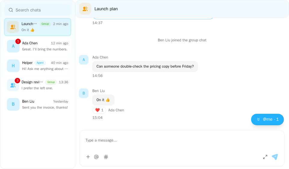
Screenshot of this demo. It runs on an in-memory sample host (useDemoHost from the demo kit, which is not part of the packages); in your app, pass the host from createChatHost() instead.
Demo source (uses the docs demo kit and Tailwind CSS classes, so it cannot be copied as is): chat-app.tsx
"use client";

import { ConversationList } from "@openmaxai/chat/conversation-list";
import { ChatHeader } from "@openmaxai/chat/header";
import { ChatHostProvider } from "@openmaxai/chat/host";
import { MessageThread } from "@openmaxai/chat/message-thread";
import { useState } from "react";
// Docs helpers: useDemoHost() is an in-memory host with sample data (no backend), and
// useDemoConversations() is its conversation list (a DM started from search is added to it).
// In your app, pass the host from createChatHost() or your own ChatHost instead.
import { useDemoConversations, useDemoHost, useIsCompact } from "./kit";

export default function ChatApp() {
	const host = useDemoHost();
	const conversations = useDemoConversations();
	const isCompact = useIsCompact();
	const [selectedId, setSelectedId] = useState<string | null>(
		isCompact ? null : conversations[0].id,
	);
	const selected = conversations.find((c) => c.id === selectedId) ?? null;

	return (
		<ChatHostProvider host={host}>
			<div className="flex h-full bg-background text-foreground">
				{/* On a phone show one column at a time: the list, or the open conversation. */}
				<aside
					className={
						isCompact ? (selected ? "hidden" : "min-w-0 flex-1") : "shrink-0"
					}
				>
					<ConversationList
						conversations={conversations}
						selectedId={selectedId}
						onSelect={(c) => setSelectedId(c.id)}
						onDeselect={() => setSelectedId(null)}
						// Starting a DM from search opens it here too.
						onSelectConversationId={setSelectedId}
					/>
				</aside>
				{selected && (
					<main className="flex min-w-0 flex-1 flex-col">
						<ChatHeader
							conversation={selected}
							headerTitle={selected.name ?? ""}
							headerSubtitle={null}
							isAgentCollab={false}
							isObserving={false}
							collabAgents={[]}
							typingText={null}
							mode={isCompact ? "compact" : "full"}
							onBack={isCompact ? () => setSelectedId(null) : undefined}
							infoPanelOpen={false}
						/>
						<MessageThread key={selected.id} conversation={selected} />
					</main>
				)}
			</div>
		</ChatHostProvider>
	);
}
This section covers the components of @openmaxai/chat. They get all data and actions from the host you provide. Swap the host to run the same components against OpenMax, your own backend or in-memory data.
These components have no style root: the SDK stylesheet (@openmaxai/chat-sdk/styles.css) applies only inside the .omx-chat component root each SDK component brings along, and ChatRoot is not a style scope itself, so rendered on their own they are unstyled. Put them inside ChatRoot and wrap them in an element with the class omx-chat (plus omx-dark in dark mode, with colorScheme="dark" on ChatRoot), or style them yourself. A wrapper alone is not enough: outside ChatRoot, dialogs, menus and popovers portal to document.body, outside your wrapper, and get no styles; within ChatRoot they land in its overlay container, which carries the class omx-chat. With a host from createChatHost, use CwsConversationList, CwsMessageThread, ConversationHeader and CwsGroupInfoPanel from @openmaxai/chat-sdk/react for the conversation list, message thread, conversation header and group info panel; see Quick start.
By surface
Left column
- Conversation list: Pinned grid, conversation rows with unread counts and drafts, search, pin and hide.
Conversation pane
Top to bottom: header, message thread (with cards and agent run progress), composer.
- Header: Title, status, typing line, group info button, agent model selector and the run entry.
- Message thread: Message history, live updates, reactions, recall and edit, read receipts, agent run progress and stop.
- Composer: The input at the bottom of the thread: text, attachments, @-mentions and # work items.
- Interactive cards: Message cards with buttons and choices, and approval cards bound to an agent run.
Overlays and side panels
- Group management: Create-group dialog, group info panel and the add-members dialog.
- Profile card: The popover that opens when you click an avatar.
- Image viewer: Opening images from messages in a full-screen viewer.
Outside the main page
- Floating windows, dock and drawer: Open a conversation on any page: floating windows, a docked column on the right, a dock for minimized windows and a bottom drawer on small screens.
Import paths
| Component | Import from |
|---|---|
ConversationList, ResizableConversationListColumn |
@openmaxai/chat/conversation-list |
ChatHeader |
@openmaxai/chat/header |
MessageThread |
@openmaxai/chat/message-thread |
COMPOSER_PLUGINS, defineComposerPlugin |
@openmaxai/chat/composer |
CreateGroupModal, ChatInfoPanel, AddMemberContainer |
@openmaxai/chat/group-management |
FloatingChatLayer, ChatDockColumn, ChatMinimizedDock, ChatMobileDrawer (for assembling it yourself; with the SDK, mount ChatDockColumn and ChatFloatingSurfaces from @openmaxai/chat-sdk/react) |
@openmaxai/chat/surfaces |
AgentRunList, AgentRunPanel, AgentRunProgress, AgentRunSteps, AgentStopButton Planned |
@openmaxai/chat/agent-runs |
Cards, profile cards, the image viewer and agent run progress are not mounted separately. They appear inside MessageThread (and ChatHeader) when the host provides the matching capability.
Providers
Wrap them from outside in; full code in Installation:
| Layer | Notes |
|---|---|
I18nextProvider |
A few surfaces read strings through useTranslation. See i18n |
ChatProvider |
Installs the host and the composer plugins. Build the host with createChatHost(config) for OpenMax or write a ChatHost for other backends; either way install it with <ChatProvider host={host}>. All plugins are installed by default, except those whose capabilities the host lacks; see Composer. See Quick start, Custom backend |
When the host lacks an optional capability, one of three things happens: the matching control is not shown, a disabled placeholder is shown, or the component that needs it throws (conversations, groupManagement). The chat components have no error boundary, so a throw unmounts the whole React tree; see Known limitations. Full table: Capabilities · When an optional capability is missing.
In the demo code on these pages, useDemoHost() is an in-memory host with sample data. In your app, use the host from createChatHost() or your own ChatHost, wrapped in the providers above.
Responsive behavior
No component takes a device switch such as "is this mobile". The chat is often embedded in a side panel, a floating window or a dock column, and a floating window on a desktop can be narrow too, so components follow the width of their own container, not the viewport, and they don't guess the device.
- Layout and styling follow the container width (CSS container queries). The breakpoint is 768 px: in a container narrower than 768 px the components use the narrow layout (spacing, composer height and button positions change), and the group info panel becomes a full-screen overlay over the conversation.
- What only the caller knows is a prop. For example, the header shows the back arrow when you pass
onBack, and not otherwise. - Behavior that CSS can't express is decided inside the component, along three separate axes; none stands in for another:
| Axis | Detected by | Decides |
|---|---|---|
| Width | Measuring its own container | Layout; whether the group info panel is a side panel or a full-screen overlay |
| Input | (pointer: coarse), the pointerType of pointer events |
Action bar on hover, or on tap / long press; swipe gestures; how early older history is fetched and how close to the bottom counts as "at the bottom" (together with the container height); no autofocus when a conversation opens, so the on-screen keyboard doesn't pop up; on touch, a long press on an image in a message shows its action bar (a tap opens the viewer with any input) |
| iOS keyboard | Platform check | Scroll and keyboard compensation that only iOS needs |
Whether a conversation sits in a floating window, a dock column or a bottom drawer is a page-level layout choice made by your app; see Floating windows, dock and drawer.