

Header
The bar above a conversation, with title, status, typing line, group info button, the agent model selector and the planned agent run entry.
Header
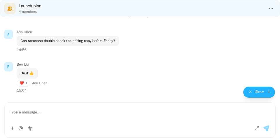
Screenshot of this demo. It runs on an in-memory sample host (useDemoHost from the demo kit, which is not part of the packages); in your app, pass the host from createChatHost() instead.
Demo source (uses the docs demo kit and Tailwind CSS classes, so it cannot be copied as is): header-group.tsx
"use client";

import { ChatHeader } from "@openmaxai/chat/header";
import { ChatHostProvider } from "@openmaxai/chat/host";
import { MessageThread } from "@openmaxai/chat/message-thread";
import { useState } from "react";
// Docs helpers: useDemoHost() is an in-memory host with sample data (no backend).
// In your app, pass the host from createChatHost() or your own ChatHost instead.
import { useDemoData, useDemoHost, useIsCompact } from "./kit";

export default function GroupHeaderDemo() {
	const host = useDemoHost();
	const { conversations, lang } = useDemoData();
	const isCompact = useIsCompact();
	const [infoOpen, setInfoOpen] = useState(false);
	const group = conversations[0];

	return (
		<ChatHostProvider host={host}>
			<div className="flex h-full flex-col bg-background text-foreground">
				<ChatHeader
					conversation={group}
					headerTitle={group.name ?? ""}
					headerSubtitle={lang === "zh" ? "4 位成员" : "4 members"}
					isAgentCollab={false}
					isObserving={false}
					collabAgents={[]}
					typingText={null}
					mode={isCompact ? "compact" : "full"}
					infoPanelOpen={infoOpen}
					// Without this callback the header draws no info-panel button.
					onToggleInfoPanel={() => setInfoOpen((open) => !open)}
				/>
				<div className="flex min-h-0 flex-1">
					{/* In a row, the thread must fill the remaining width itself, or it shrinks to its content and no longer lines up with the header. */}
					<div className="flex min-w-0 flex-1 flex-col">
						<MessageThread conversation={group} />
					</div>
					{infoOpen && (
						<aside className="w-56 shrink-0 border-l p-4 text-muted-foreground text-sm">
							{lang === "zh"
								? "infoPanelOpen 为 true 时,在这里放你的群信息面板。"
								: "infoPanelOpen is true: put your group info panel here."}
						</aside>
					)}
				</div>
			</div>
		</ChatHostProvider>
	);
}
The demo uses an in-memory host (useDemoHost). In a real app the
host comes from createChatHost; ChatHeader only needs to render inside its provider.
When to use
- Above a
MessageThread, which does not render a header itself. - Your app computes the title, subtitle and badge; the header doesn't classify conversations.
- The
trailingslot holds your own controls, such as minimize / close on a floating window.
Examples
The first section uses the SDK's ConversationHeader; the ones after it use ChatHeader from @openmaxai/chat/header, which has no style root: the SDK stylesheet applies only inside the .omx-chat component root each SDK component brings along, and ChatRoot is not a style scope itself, so it renders unstyled as written. To use it, put it inside ChatRoot and wrap it in an element with the class omx-chat (plus omx-dark in dark mode, with colorScheme="dark" on ChatRoot), or style it yourself; with a host from createChatHost, use ConversationHeader. A wrapper alone is not enough: outside ChatRoot, dialogs, menus and popovers portal to document.body, outside your wrapper, and get no styles; within ChatRoot they land in its overlay container, which carries the class omx-chat.
SDK conversation header
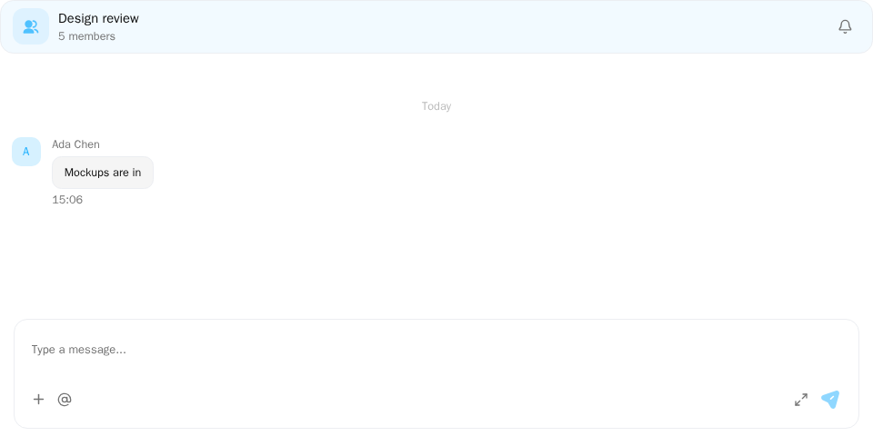
Screenshot of this demo. It runs on an in-memory sample host (useDemoHost from the demo kit, which is not part of the packages); in your app, pass the host from createChatHost() instead.
Demo source (uses the docs demo kit and Tailwind CSS classes, so it cannot be copied as is): header-sdk.tsx
"use client";

import {
	ChatProvider,
	ConversationHeader,
	CwsMessageThread,
	createChatHost,
} from "@openmaxai/chat-sdk/react";
import { createMemoryAdapter } from "@openmaxai/chat-sdk/testing";
import { useEffect, useMemo } from "react";
// Docs helpers: page language and the toast line at the bottom of the demo.
import { useDemoData, useDemoNotify } from "./kit";

export default function SdkHeaderDemo() {
	const { lang, members } = useDemoData();
	const notify = useDemoNotify();
	// In your app the host comes from createChatHost() with your adapter. The memory adapter
	// implements `conversations.setMuted`, so the header shows the mute toggle.
	const host = useMemo(
		() =>
			createChatHost({
				adapter: createMemoryAdapter({
					me: members[0],
					people: members.slice(1),
					conversations: [
						{
							id: "design",
							name: lang === "zh" ? "设计评审" : "Design review",
							messages: [
								{
									senderId: members[1]?.memberId ?? "me",
									text: lang === "zh" ? "稿子发群里了" : "Mockups are in",
								},
							],
						},
					],
				}),
				locale: lang === "zh" ? "zh-CN" : "en",
				ports: { attention: { notify, setUnreadSignal: () => {} } },
			}),
		[lang, members, notify],
	);
	useEffect(() => () => host.dispose(), [host]);
	const conversation = {
		id: "design",
		type: "GROUP" as const,
		name: lang === "zh" ? "设计评审" : "Design review",
		created_at: "2026-10-01T00:00:00Z",
		last_message_at: "2026-10-01T00:00:00Z",
		unread_count: 0,
		member_count: members.length,
		is_observer: false,
	};

	return (
		<ChatProvider host={host}>
			<div className="flex h-full flex-col bg-background text-foreground">
				{/* Title, member count and mute come from the conversation; on a narrow
				    screen `onBack` adds a back arrow. */}
				<ConversationHeader
					conversation={conversation}
					onBack={() => notify("info", "onBack()")}
				/>
				<CwsMessageThread conversation={conversation} />
			</div>
		</ChatProvider>
	);
}
With createChatHost, render ConversationHeader: title, avatar, badge and member count come from the conversation and match its row in the conversation list. It reads the latest list row with the same id, so it follows mute, member count and rename; when the conversation is not in the loaded list (hidden, opened from a link), the mute toggle reads the result of the last successful change (dropped once you switch to another conversation); opening it from a link again after a successful mute change reads the new state.
conversation-pane.tsx
import { ConversationHeader, CwsMessageThread } from "@openmaxai/chat-sdk/react";

<ConversationHeader
  conversation={selected}
  onBack={() => setSelected(null)}
  trailing={<MyButton />}
/>;
<CwsMessageThread conversation={selected} />;
- Mute: the toggle appears when the host has
conversations.setMuted(the OpenMax adapter does), not for observed conversations; failures go throughattention.notify. - Back: the back arrow shows only on narrow screens (viewport under 768 px) and when
onBackis passed. For a one-column-at-a-time layout useChatSplitLayout; browser back needs your app to wire history itself. - Group info: the button appears only with
onToggleInfoPanel, and only in groups. The Chat SDK'sConversationHeaderalso needs the host to havegroupManagementand the conversation not to be observed; otherwise it is not drawn even when passed.trailingrenders at the far right. - Typing indicator and peer presence: the subtitle line shows the typing indicator; in a DM with an Agent it shows the peer's online status (from the member profile and
presencesignals; nothing is drawn while the status is unknown rather than guessing "offline", and a billing-suspended peer still shows "Paused · unpaid"). What is still missing is in Known limitations. Props are in the API reference.
Group conversation
conversation-header.tsx
import { ChatHeader } from "@openmaxai/chat/header";

<ChatHeader
  conversation={conversation}
  headerTitle={titleFor(conversation)}
  headerSubtitle={`${memberCount} members`}
  isAgentCollab={conversation.type === "BRIDGE"}
  isObserving={conversation.is_observed === true}
  collabAgents={[]}
  typingText={null}
  infoPanelOpen={infoOpen}
  onToggleInfoPanel={() => setInfoOpen((v) => !v)}
/>;
The info button opens ChatInfoPanel. It appears only for GROUP
conversations when you pass onToggleInfoPanel.
Agent DM with the model selector
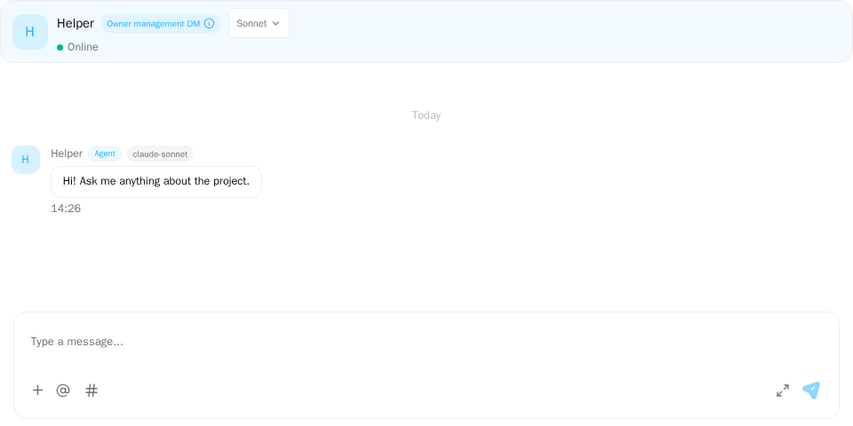
Screenshot of this demo. It runs on an in-memory sample host (useDemoHost from the demo kit, which is not part of the packages); in your app, pass the host from createChatHost() instead.
Demo source (uses the docs demo kit and Tailwind CSS classes, so it cannot be copied as is): header-agent-dm.tsx
"use client";

import { ChatHeader } from "@openmaxai/chat/header";
import { ChatHostProvider } from "@openmaxai/chat/host";
import { MessageThread } from "@openmaxai/chat/message-thread";
// Docs helpers: useDemoHost() is an in-memory host with sample data (no backend).
// In your app, pass the host from createChatHost() or your own ChatHost instead.
import { AGENT, useDemoData, useDemoHost, useIsCompact } from "./kit";

export default function AgentDmHeaderDemo() {
	// The demo host provides `agentConfig` (model selector) and `profileCard` (clickable avatar).
	const host = useDemoHost();
	const { conversations } = useDemoData();
	const isCompact = useIsCompact();
	const dm = conversations.find((c) => c.id === "helper");
	if (!dm) return null;

	return (
		<ChatHostProvider host={host}>
			<div className="flex h-full flex-col bg-background text-foreground">
				<ChatHeader
					conversation={dm}
					headerTitle={dm.name ?? ""}
					headerSubtitle={null}
					isAgentCollab={false}
					isObserving={false}
					collabAgents={[]}
					dmPeerStatus="online"
					typingText={null}
					mode={isCompact ? "compact" : "full"}
					infoPanelOpen={false}
					// Your own agent: the header shows the model selector for it.
					isAgentOwnerDm
					agentModelMemberId={AGENT}
				/>
				<MessageThread conversation={dm} />
			</div>
		</ChatHostProvider>
	);
}
In a DM with an agent you own, the header can switch the model and toggle whether its name is visible to others.
<ChatHeader
  /* …required props */
  isAgentOwnerDm
  agentModelMemberId={agentMemberId}
/>
Without agentModelMemberId nothing is drawn. The data comes from the host's agentConfig capability:
agent-config.ts
import type { ChatAgentConfigPort } from "@openmaxai/chat/host";

export const agentConfig: ChatAgentConfigPort = {
  async loadModelState(agentMemberId) {
    const res = await api.getAgentModel(agentMemberId);
    if (!res.ok) return undefined; // the header shows a disabled placeholder
    return {
      effectiveModel: res.body.active,
      desiredModel: res.body.requested,
      applyState: res.body.pending ? "applying" : "ready",
      visible: res.body.public,
      configurable: res.body.canEdit,
      availableModels: res.body.choices.map((c) => ({ key: c.id, displayName: c.label })),
    };
  },
  setModel: (agentMemberId, model) => api.setAgentModel(agentMemberId, model),
  setModelVisibility: (agentMemberId, visible) => api.setAgentModelVisibility(agentMemberId, visible),
};
- Resolve
undefinedfromloadModelStatewhen the model can't be read; don't throw. setModelresolving means "accepted". The header reloads the state and shows "applying" untilapplyStateisready.- For someone else's agent, pass
dmPeerModelLabelfor a read-only label.
With @openmaxai/chat-sdk, the adapter's agentConfig has this same type under the SDK's own name,
ChatSdkAdapterAgentConfig, so the adapter needs no import
from @openmaxai/chat/host.
Single-column layouts and floating windows
<ChatHeader
  /* …required props */
  mode="compact"
  onBack={() => setSelectedId(null)}
  trailing={<WindowControls />}
/>
The back arrow shows only when you pass onBack; you decide when, for example only in a layout
that shows one column at a time. The header's layout follows the width of its container, so you
don't tell it whether it is on mobile; see Responsive behavior.
If the header sits in a floating layer above your app's overlays, pass overlayContainer so its
popovers render inside that layer.
Agent run entry
Planned
Once the host provides the agentRuns capability, the header shows an entry for each agent with unfinished runs, such as "Assistant · 2 running · 1 queued". Opening it shows that agent's runs in this conversation (AgentRunList).
Today: run summary (transitional)
Transitional
Until the run entry above lands, a header under the Chat SDK already shows a one-line run summary, which is read-only progress (experimental · transitional). While the host's agentActivity has a run in this conversation that is in progress (queued, thinking or calling a tool) and not out of sync, ConversationHeader shows the summary where the subtitle goes, ahead of the typing indicator; when all runs end (terminal, out of sync, evicted, scope ended) it falls back to the typing indicator below. ChatHeader does not compute it: the text comes in through typingText as well.
| Runs in progress | Shows (key in the chat namespace) |
|---|---|
| One, queued | "Assistant is waiting" (agentRun.header.queued); in a DM the current user is in, no name: "Waiting" (agentRun.state.queued) |
| One, working | "Assistant is working" (agentRun.header.working); in a DM the current user is in, no name: "Working" (agentRun.state.working) |
| Two or more from the same Agent | "Assistant is working (2 messages)" (agentRun.header.workingCount), "Assistant is waiting (2 messages)" (agentRun.header.queuedCount) when all are queued; in a DM the current user is in, no name: "Working (2 messages)" (agentRun.state.workingCount) / "Waiting (2 messages)" (agentRun.state.queuedCount) |
| Two or more Agents | "2 Agents are working" (agentRun.header.many), counting distinct Agents, not runs |
The name comes from this conversation's members, "Unknown member" when not found. The header shows a fixed state only, not what the agent is doing; that is in the run block in the message thread. The run entry above replaces it when the planned Agent runs capability lands.
Typing indicator
When someone other than the current user is typing in the conversation, the header shows it where the subtitle goes, over the peer status and the subtitle. ChatHeader does not compute it: the text comes in through typingText; with the Chat SDK, ConversationHeader computes it for you (from the typing signals handed over by the adapter's realtime).
| Who is typing | Shown (key in the chat namespace) |
|---|---|
| The other person in a DM the current user is in | "Typing…" (typing.peer) |
| Otherwise, one person | "Alice is typing…" (typing.one; "Unknown member" when the name is not found) |
| Otherwise, two or more | "3 people are typing…" (typing.many) |
- Other people only. Typing on another tab or device of your own is not shown; nothing is shown until the current user is known (
GET /mehas returned). - Expires on its own. It goes away 6 seconds after the last "start" with no new one; a "stop" removes it at once. A new message from that person does not clear it early.
- Agents are shown too.
- Whether observers see it is up to the backend: OpenMax currently sends
typingonly to conversation members. - Your own typing is not shown to others: the Chat SDK does not send
typingyet; see Known limitations.
The data comes from typing signals; see Realtime and sync · Realtime signals. Conversation list rows do not show typing.
API
| Prop | Type | Default | Description |
|---|---|---|---|
conversation |
ChatConversation |
required | The open conversation |
headerTitle |
string |
required | Title |
headerSubtitle |
string | null |
required | Subtitle; agent DMs show the agent's status instead |
isAgentCollab |
boolean |
required | Agent collaboration conversation; shows the collaborating agents |
isObserving |
boolean |
required | The viewer observes this conversation (read-only) |
collabAgents |
CollabAgent[] |
required | Agents shown for a collaboration conversation |
typingText |
string | null |
required | The "is typing" text, see Typing indicator; null hides it |
infoPanelOpen |
boolean |
required | Pressed state of the info button |
dmPeerStatus |
OnlineStatus |
— | DM peer's online status |
peerStatusAvailable |
boolean |
true |
Whether the peer's online status is known. With false, the Agent DM status line only shows when the peer is suspended for billing, never "offline" |
mode |
"full" | "compact" |
"full" |
Density (spacing only). compact for mobile and floating windows |
showIdentity |
boolean |
true |
Whether to render the conversation's avatar and name. The docked column passes false (the tab already shows them); everything else is unaffected |
inlineMeta |
boolean |
false |
Put the status line (typing / peer status / subtitle) and the badges / model on one non-wrapping line, status first; the name (when shown) gets its own line above. The docked column and the drawer pass true; badges and the model name truncate instead of wrapping |
onBack |
() => void |
— | Back arrow handler; the arrow shows when it is passed |
onToggleInfoPanel |
() => void |
— | Group info button; none when omitted, and none when onToggleInfoSidebar is passed |
onToggleInfoSidebar |
() => void |
— | Conversation info sidebar button, for every conversation type; replaces the group info button. None when omitted. @experimental |
infoSidebarOpen |
boolean |
false |
Whether that sidebar is open: the button's pressed look and aria-expanded |
infoSidebarId |
string |
— | id of the sidebar element; set as the button's aria-controls while it is open |
isMuted |
boolean |
false |
Muted: the toggle shows a crossed-out bell |
onToggleMute |
() => void |
— | Mute toggle handler; no toggle when omitted |
muteDisplay |
"toggle" | "marker" |
"toggle" |
How mute shows: "toggle" is an always-present bell; "marker" draws no bell, only a "Muted" marker after the name while muted, which calls onToggleMute (to unmute). Applies to groups only: other conversations keep the bell. Used with the conversation info sidebar. @experimental |
memberCounts |
{ people: number; agents: number } | null |
null |
People and Agents in the group. For a group, together with onOpenMembers, the member count under the name becomes "N people · N Agents", two buttons; otherwise the subtitle shows as given. @experimental |
onOpenMembers |
(tab: "people" | "agents") => void |
— | One of those two counts was clicked: open the member list on that page. @experimental |
onOpenPeerInfo |
() => void |
— | Given ⇒ in a DM the peer's avatar and name are buttons that call this (open the conversation info sidebar on its "Info" tab) instead of popping up the peer's profile card. Observed DMs get them too (unlike the card; the sidebar is their read-only view); not DMs with a system member, Agent collaboration conversations or groups. @experimental |
onPopOut |
() => void |
— | "Pop out to floating window" button after mute and group info; none when omitted. Whether a window can open here is up to you |
isAgentOwnerDm |
boolean |
false |
Viewer owns the agent in this DM: owner badge and model selector |
agentModelMemberId |
string |
— | Agent member id to configure. Read only when isAgentOwnerDm |
dmPeerModelLabel |
string | null |
— | Read-only model label for someone else's agent |
badge |
ChatHeaderBadge | null |
null |
{ label, bg, color } pill next to the title |
trailing |
ReactNode |
— | Rightmost slot |
rootProps |
ComponentPropsWithoutRef<"div"> |
— | Extra props on the root; className is merged |
overlayContainer |
HTMLElement | null |
— | Where popovers and dialogs portal to |
CollabAgent is { name: string; online_status?: OnlineStatus | null } and OnlineStatus is "online" | "starting" | "stopping" | "offline" | "error" | "unknown" (the same as a member's online_status in the Data model). Both types are exported from @openmaxai/chat/header Planned.
Capabilities
| Capability | Without it |
|---|---|
agentConfig |
Owner DMs show a disabled placeholder where the selector would be |
profileCard |
The DM avatar and name are not clickable. See Profile card |
agentRuns Planned |
No agent run entry |
The adapter's realtime (typing / presence signals, ConversationHeader) |
No typing indicator; presence in an Agent DM comes only from member profiles and does not follow live changes |
The adapter's profiles (ConversationHeader) |
Presence in an Agent DM appears only after the first presence signal; with neither, the status line only shows when the peer is suspended for billing |
Accessibility
- The back button, owner badge button and model selector are labelled. The selector sets
aria-busywhile applying and reports failures withrole="alert". - The group info button is icon-only and gets its accessible name from
aria-label. Planned - The typing indicator and the peer status are not in a live region: changes are not announced; screen reader users read them with the rest of the header.
FAQ
The info button doesn't show up.
It needs a GROUP conversation and onToggleInfoPanel.
The model selector is missing or greyed out.
Pass both isAgentOwnerDm and agentModelMemberId. Greyed out means the host has no
agentConfig, loadModelState returned undefined, or the state has configurable: false or no
availableModels.