

Composer
The message input at the bottom of the thread, with @-mentions,
Composer
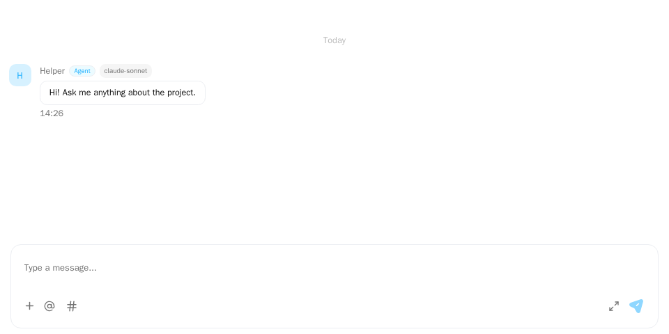
Screenshot of this demo. It runs on an in-memory sample host (useDemoHost from the demo kit, which is not part of the packages); in your app, pass the host from createChatHost() instead.
Demo source (uses the docs demo kit and Tailwind CSS classes, so it cannot be copied as is): composer-basic.tsx
"use client";

import { ChatHostProvider } from "@openmaxai/chat/host";
import { MessageThread } from "@openmaxai/chat/message-thread";
// Docs helpers: useDemoHost() is an in-memory host with sample data (no backend).
// In your app, pass the host from createChatHost() or your own ChatHost instead.
import { useDemoData, useDemoHost } from "./kit";

export default function ComposerDemo() {
	// The composer is part of MessageThread. With the default plugin set it supports
	// `@` (mention a member, needs `identity`) and `#` (reference a work item, needs `workItems`).
	const host = useDemoHost();
	const { conversations } = useDemoData();

	return (
		<ChatHostProvider host={host}>
			<div className="flex h-full flex-col bg-background text-foreground">
				<MessageThread conversation={conversations[2]} />
			</div>
		</ChatHostProvider>
	);
}
The demo code's useDemoHost() is an in-memory host; see Overview for wiring a real one.
When to use
- Every
MessageThreadrenders its own composer (rich text, attachments, reply bar, toolbar). You don't mount it. - What you configure is the plugin set: which triggers and toolbar buttons it has. Each plugin declares the capabilities it needs. The plugin set goes to
ChatProvidertogether with the host. What plugins can do and how to write your own: Plugins.
| Plugin id | Trigger | What it does | requiredPorts |
|---|---|---|---|
emoji Planned |
Toolbar button | Opens an emoji panel and inserts the picked emoji as text; there whether collapsed or expanded | none |
mention |
@ (also a toolbar button) |
Suggests conversation members, plus "all" and "all agents" where allowed; sends structured mentions | identity, i18n |
work-reference |
# (also a toolbar button) |
Searches projects and issues and inserts a reference chip; sent as [#label](resourceUri) |
workItems |
Details of each are in Built-in plugins.
Examples
Use a different plugin set
Without plugins you get the built-in plugins (COMPOSER_PLUGINS). To use another set, pass it to ChatProvider:
app.tsx
import { COMPOSER_PLUGINS } from "@openmaxai/chat/composer";
import { ChatProvider } from "@openmaxai/chat-sdk/react";

<ChatProvider host={host} plugins={COMPOSER_PLUGINS.filter((p) => p.id === "mention")}>
  {/* MessageThread … */}
</ChatProvider>;
The SDK does not install a plugin whose requiredPorts name a capability the host lacks, so you don't filter for that yourself; see Capabilities. The list can be written inline as above: the SDK compares plugins by id and does not rebuild the editor while the ids stay the same (so swapping a plugin object under the same id has no effect).
Without work items
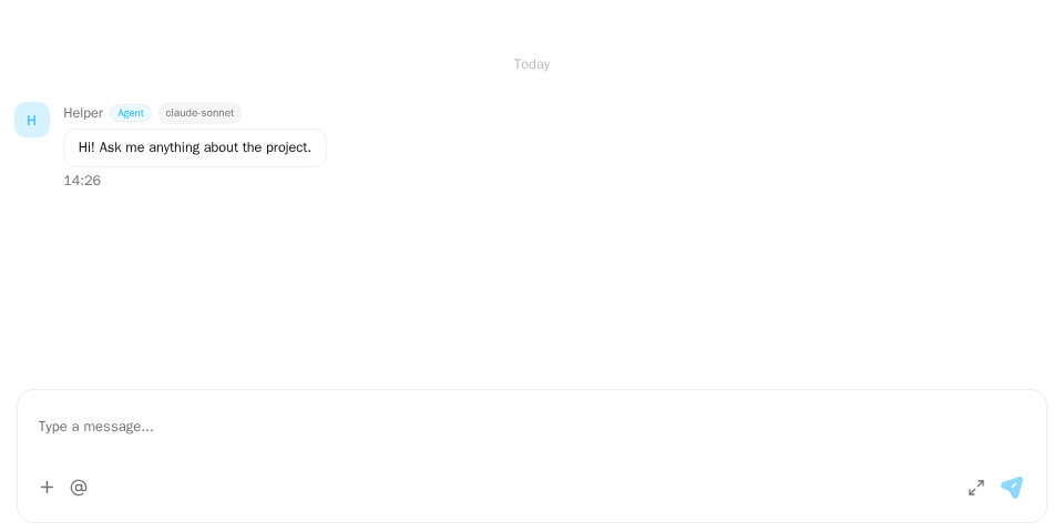
Screenshot of this demo. It runs on an in-memory sample host (useDemoHost from the demo kit, which is not part of the packages); in your app, pass the host from createChatHost() instead.
Demo source (uses the docs demo kit and Tailwind CSS classes, so it cannot be copied as is): composer-without-work-items.tsx
"use client";

import { MessageThread } from "@openmaxai/chat/message-thread";
import { ChatProvider } from "@openmaxai/chat-sdk/react";
import { QueryClient, QueryClientProvider } from "@tanstack/react-query";
import { useState } from "react";
// Docs helpers: useDemoHost() is an in-memory host with sample data (no backend).
// In your app, pass the host from createChatHost() or your own ChatHost instead.
import { useDemoData, useDemoHost } from "./kit";

export default function ComposerWithoutWorkItems() {
	const host = useDemoHost({ without: ["workItems"] });
	const { conversations } = useDemoData();
	// The legacy MessageThread reads react-query and the host brings none: wrap a QueryClientProvider
	// yourself.
	const [queryClient] = useState(() => new QueryClient());

	return (
		<QueryClientProvider client={queryClient}>
			{/* The host has no `workItems`, so ChatProvider leaves out the `#` plugin; `@` stays. */}
			<ChatProvider host={host}>
				<div className="flex h-full flex-col bg-background text-foreground">
					<MessageThread conversation={conversations[2]} />
				</div>
			</ChatProvider>
		</QueryClientProvider>
	);
}
A host without workItems does not get work-reference: # is a plain character and the toolbar has no # button. @ still works.
@-mentions
Type @ or press the toolbar button, then pick with the arrow keys and Enter, or click. Mentioned people see the @me capsule in their thread.
# work items
Type # to search projects and issues; expanding a project lists its issues in the same panel. The host's workItems capability provides the search:
work-items.ts
import type { ChatWorkItemsPort } from "@openmaxai/chat/host";

export const workItems: ChatWorkItemsPort = {
  search: async ({ search, projectId, cursor }) => {
    const page = await api.searchWorkItems({ q: search, project: projectId, after: cursor });
    return {
      items: page.items.map((w) => ({
        id: w.id,
        kind: w.type === "project" ? "project" : "issue",
        label: w.type === "project" ? w.name : `${w.projectName} / ${w.title}`,
        resourceUri: w.uri,
        projectId: w.type === "project" ? undefined : w.projectId,
      })),
      nextCursor: page.next ?? undefined,
    };
  },
};
Return a flat list. When projectId is set, return only that project's issues.
With @openmaxai/chat-sdk, the adapter's workItems has this same type under the SDK's own name, ChatSdkAdapterWorkItems, so the adapter needs no import from @openmaxai/chat/host.
Expanded editor
The composer has two states, collapsed and expanded. Normally it is the collapsed composer; the expand button left of the send button in the bottom bar makes the composer grow in place and fill the conversation area for long messages, and the message list gives up its height; the composer leaves the same gap at the top as on its left and right, so it does not touch the conversation header. A longer body scrolls inside the editor, and the + menu, plugin buttons, attachments and the send button stay in the bottom bar. The collapse button returns to the normal composer.
- Expanding and collapsing keep what has been typed, the caret position, attachments and the reply bar, and focus stays in the editor.
- Expanded,
Enterinserts a line break andCtrl/Cmd+Entersends; collapsed, the composer follows thecomposerPreferencessetting,Entersends by default. While an input method is composing,Enterbelongs to the input method. - Sending a message collapses the composer; switching conversations returns it to collapsed, and the expanded state is not saved.
Escapedoes not collapse.- Narrow screens (the phone layout) have no expand button. The composer for editing a sent message does not expand.
- The expanded editor is built into the composer, not a plugin, and is on by default; set
composerExpandableonChatProvidertofalseto remove the expand button.
Formatting and Markdown
Planned
The collapsed composer is a mini version of the expanded one: formatting, emoji and the other plugins work in both states, and expanding fixes the formatting toolbar at the top of the editor. Expanding adds no other input and there is no separate title: to get a heading, write it in Markdown in the body, for example by starting a line with # . With expanding switched off (composerExpandable set to false), formatting still works in the collapsed composer.
Formatting: bold, strikethrough, italic, underline, ordered list, unordered list, quote, link, code.
- Collapsed, there are two ways in: the "Aa" button in the bottom bar brings up the formatting toolbar, and selecting text floats a format bar with the same buttons above the selection.
- Expanded, the formatting toolbar is fixed at the top of the editor.
- The buttons are optional: the composer understands Markdown as you type, collapsed or expanded. Finish typing
**xxx**and it turns bold at once;*xxx*turns italic,~~xxx~~strikethrough, text wrapped in backticks code, and-,1.or>at the start of a line become a list or a quote. - The composer does not escape Markdown characters typed literally: a
*,#and the like that are not turned into formatting stay in the body as typed, and recipients see the body drawn as Markdown.
Layout of the two states:
- Collapsed: the body, with the bottom bar below it: "Aa", plugin toolbar buttons (emoji,
@,#and so on), attachments, the+menu, the expand button and the send button. - Expanded: from top to bottom, the formatting toolbar, the body and the bottom bar. The bottom bar holds the plugin toolbar buttons, attachments, the
+menu, the collapse button and the send button.
The formatting buttons and Markdown-as-you-type do not depend on host capabilities; every host has them.
What is sent: a message is one Markdown string, with no split between title and body and no separate format marker.
textonSendMessageInputis the Markdown source, collapsed or expanded alike. Without formatting it is just plain text.- The host passes
textto the backend as usual and does nothing else for formatting; see Host capabilities ·messaging. - The bodies of messages from people are all drawn as Markdown (
render.renderMessageText), with mentions and links as usual. See Data model.
Plugins when expanded: triggers, candidate panels and content nodes of @ and # work as usual, and so does the structured send data (such as mentions). Plugin toolbar buttons move to the bottom bar; buttons placed in the + menu stay there. See Composer plugins · Toolbar button.
Sending typing
Planned
While the user types, the composer tells the other people in the conversation through the host's messaging.sendTyping, and their header shows the typing indicator.
| When | Call |
|---|---|
| The text goes from empty to non-empty, or 3 seconds have passed since the last call while typing continues | sendTyping(conversationId, true) |
| Send, clearing the text, switching conversation, the composer unmounting, or 5 seconds without typing | sendTyping(conversationId, false) |
- Only a real change of the text counts as typing: moving the caret, selecting, an IME composition in progress, or only adding attachments do not.
- No
truewhile the text is empty; after afalseno furtherfalseis sent. - Read-only conversations (observing, agent collaboration, DMs where you cannot send) send nothing.
- When
sendTypingfails it is silent: no notice, no retry; the next keystroke sends again. - A host without
sendTypingsends nothing; the rest of the composer is unchanged.
API
Composer props on ChatProvider
The composer has no provider of its own: plugins and toolbar placement are set on ChatProvider, and the whole chat uses one set. The other ChatProvider props are in @openmaxai/chat-sdk.
| Prop | Type | Default | Description |
|---|---|---|---|
plugins |
readonly ComposerPlugin[] |
COMPOSER_PLUGINS |
Plugins to install. Plugins whose capabilities the host lacks are skipped; compared by plugin id, so swapping a plugin object under the same id has no effect |
toolbarPlacement |
ComposerToolbarPlacementOverrides |
— | Per toolbar item id: "bar" (shown on the toolbar) or "plus-menu" (moved into the + menu). Unset items use the plugin's own default |
composerExpandable |
boolean |
true |
Whether there is an expanded editor button |
Other exports from @openmaxai/chat/composer
| Export | Description |
|---|---|
COMPOSER_PLUGINS |
All registered plugins |
defineComposerPlugin |
Defines a plugin: schema nodes, trigger and candidate panel, send payload data, toolbar buttons, requiredPorts. Trigger or node-name conflicts throw when the set is assembled. See Write a composer plugin |
ChatFileDropZone |
Wrap the header and thread so files dropped on the header reach the composer; props below |
ComposerPlugin, ComposerToolbarPanelProps |
Types for writing plugins |
ComposerCandidate, ComposerPanelProps, ComposerToolbarItem, ComposerNodeSpec |
Types for writing plugins: candidate, candidate panel props, toolbar button, content node spec Planned |
ChatFileDropZone
Wraps the header and the thread: a file dropped anywhere inside it (the header included) goes to the composer of the MessageThread inside, under the composer's rules (files over the size limit are refused, the rest cut to the remaining slots). While the conversation is read-only, or while no MessageThread is inside, it shows no drop overlay and takes nothing. Without it, only the thread and composer take drops.
| Prop | Type | Default | Description |
|---|---|---|---|
children |
ReactNode |
required | The header and the MessageThread |
className |
string |
— | Added to the wrapping element |
Put one MessageThread in a ChatFileDropZone; with two, the one mounted last takes the files.
Capabilities
| Capability | Without it |
|---|---|
workItems |
The plugin that needs it is not installed: no #, the rest works |
composerPreferences |
Enter sends, Shift+Enter adds a line. With it, the host can set Ctrl/Cmd+Enter to send instead |
attachments (attachment limit of 0) |
No attach button |
drafts |
Required; saves and restores the draft per conversation |
identity, i18n |
Required; used by @ mentions |
messaging (sendTyping) Planned |
Others don't see that you are typing |
Accessibility
- The editor is a focusable
role="textbox"witharia-multiline="true", labelled by the placeholder. - In a candidate panel,
ArrowUp/ArrowDownmove,Enterpicks,Escapecloses. Expandable#rows havearia-expanded. Enterduring IME composition goes to the input method and never sends.- Toolbar icon buttons, the send button and the
+menu button are labelled; the+button reportsaria-expanded.
FAQ
Can I render the composer on its own?
No. The composer is not exported on its own: its props come from the thread's internals (editor ref, send handler, reply state). Use the composer MessageThread renders, and change it through the plugin set and the toolbarPlacement and composerExpandable props of ChatProvider (see Plugins).